Sounds familiar?
What gets in the way today.
Headlines say a conflict started, not how big it is.
Events and deaths over time, from UCDP.
Maps in articles are months old.
Maps that follow the data as it is published.
Who depends on whom is scattered.
Trade routes, chokepoints and resources in one view.
Alliances and sanctions are hard to picture.
Both as maps, and a mind map per country.
With DESK
What changes.
01
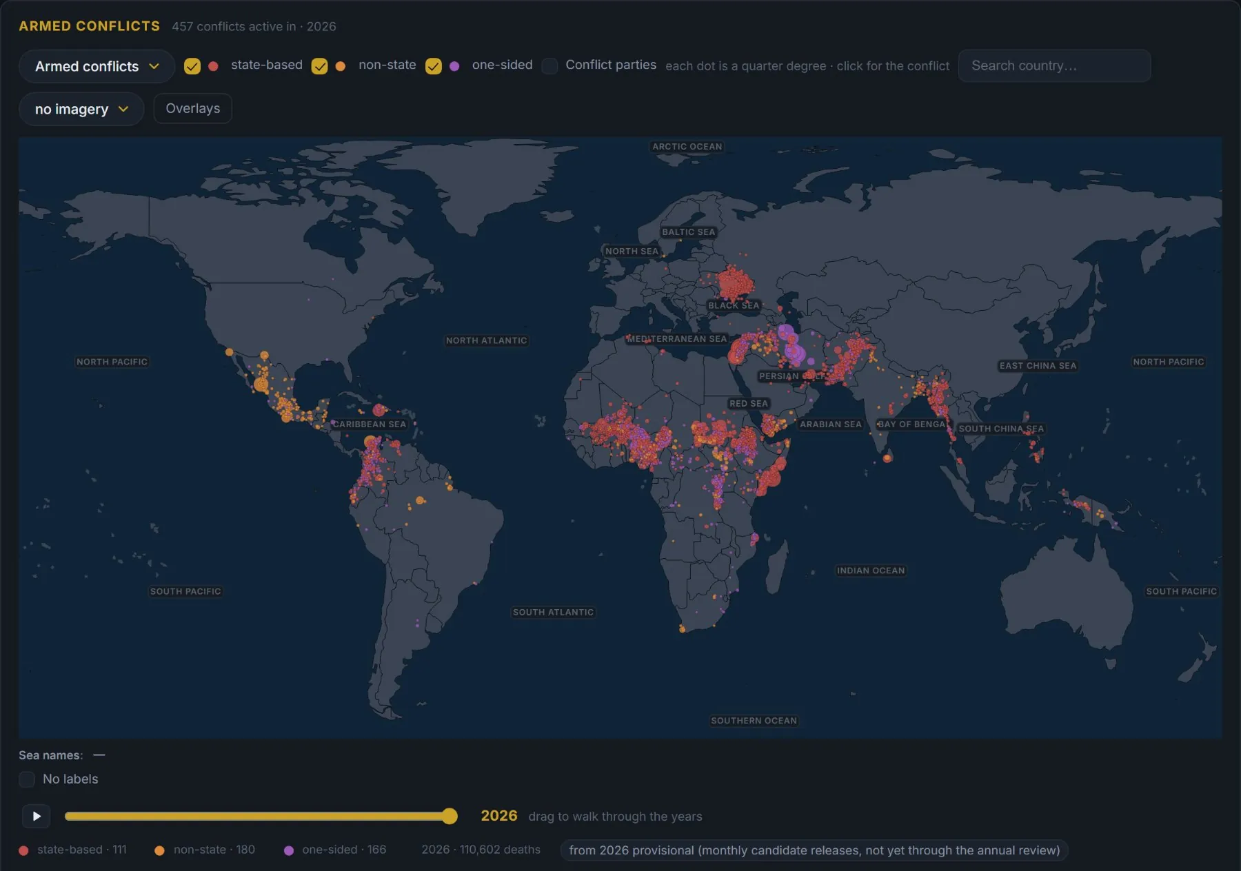
See where fighting happens
Conflicts on the map from 1946, located event by event from 1989, with who fights whom and the deaths behind it.
Macro Terminal →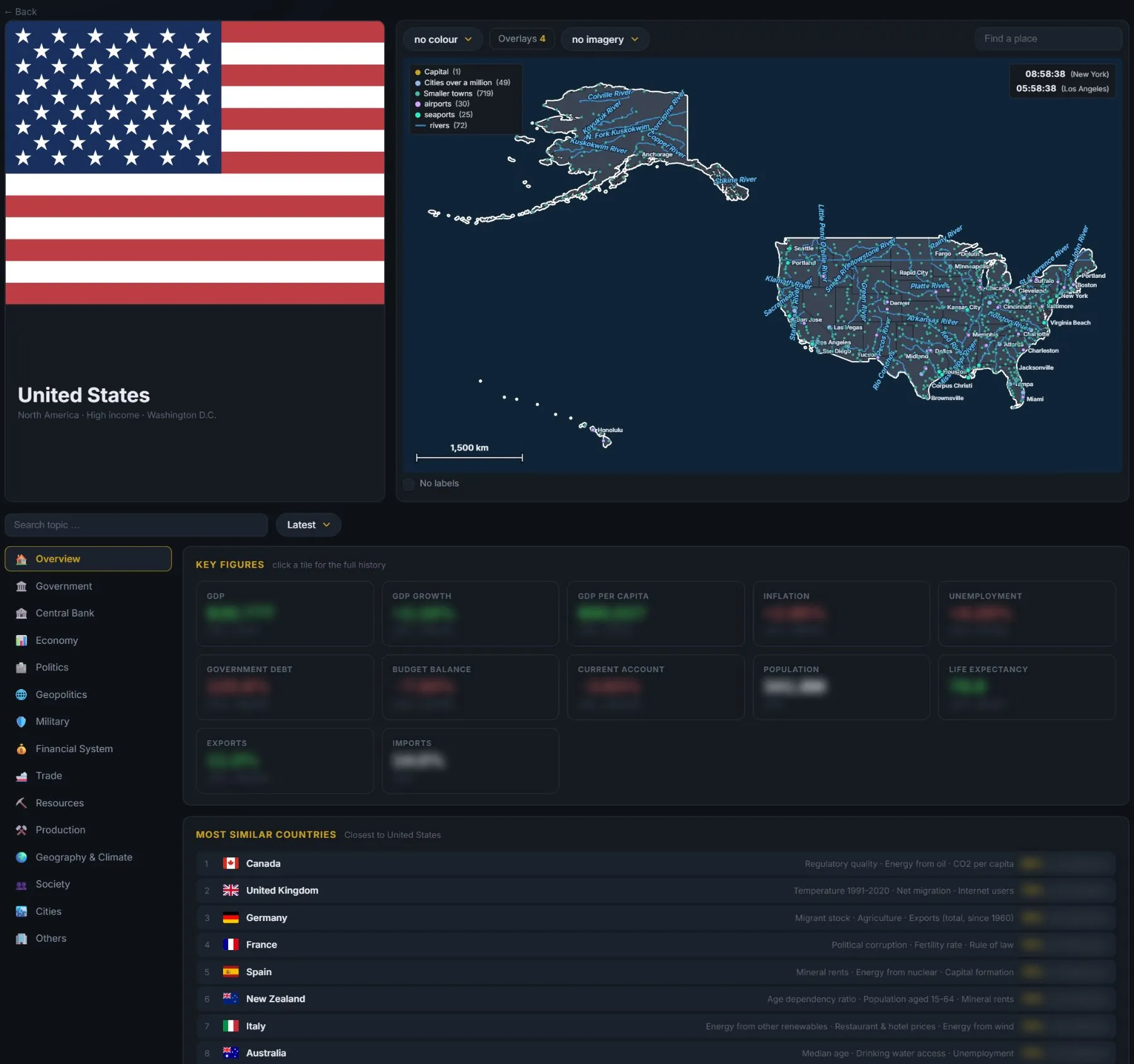
02
Understand one country
Government, politics, geopolitics and military on the country page — next to the economy that pays for it.
Macro Terminal →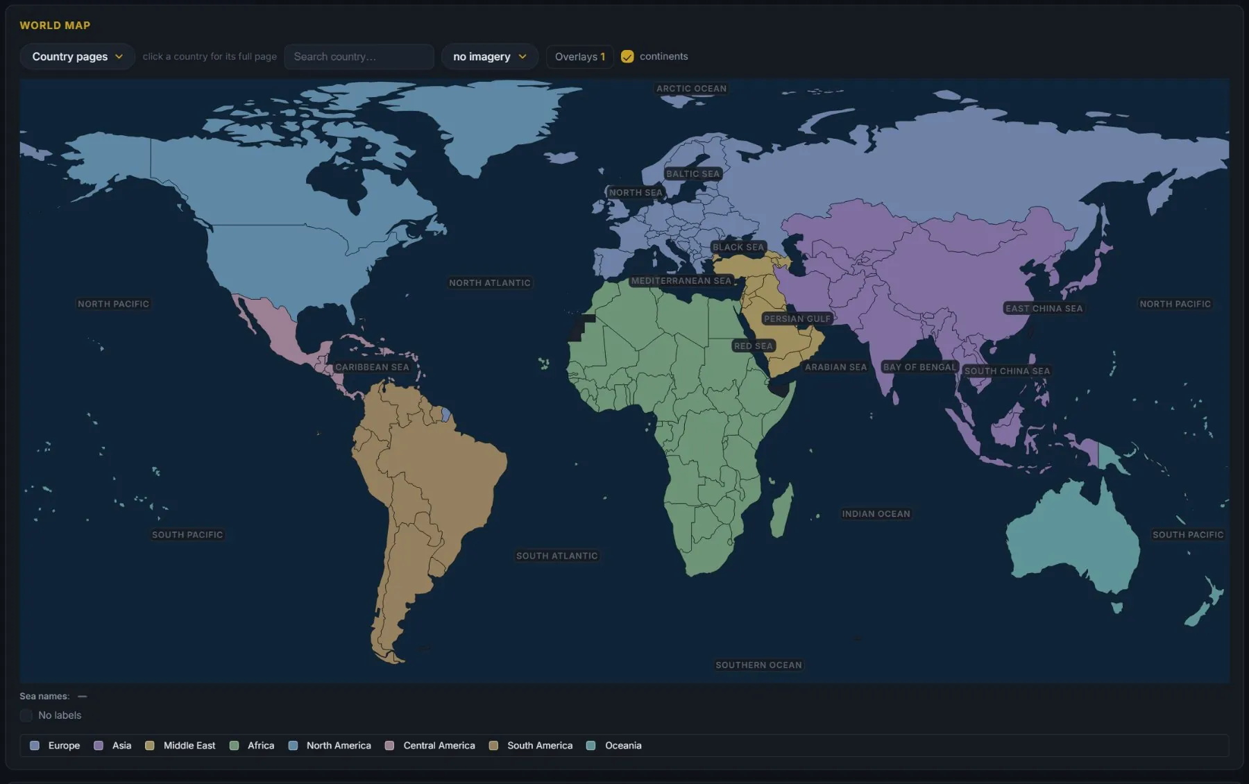
03
Follow the dependencies
Trade, money and refugee flows, and the corridors and chokepoints goods pass through.
Macro Terminal →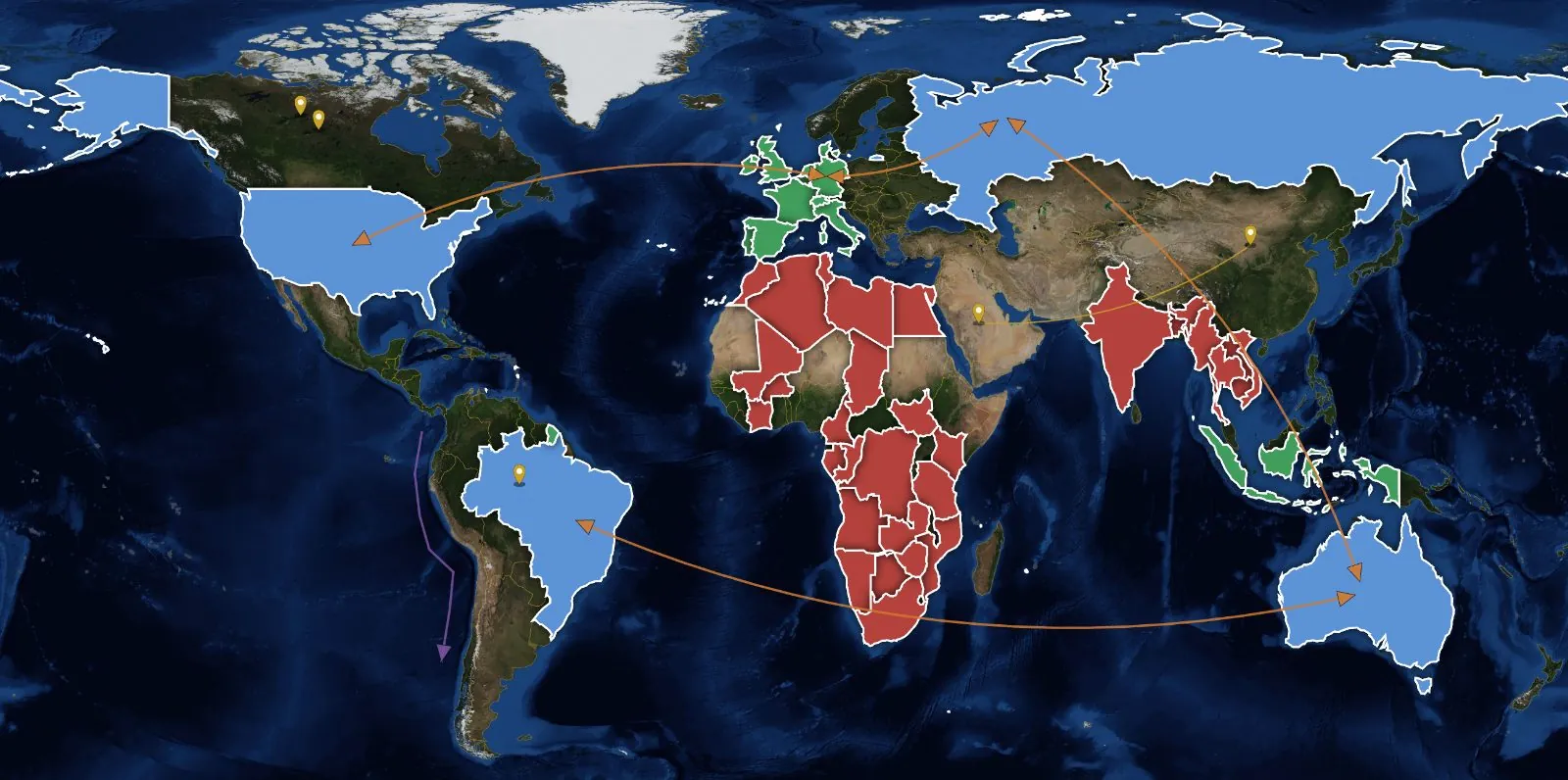
04
Draw your own situation map
Colour blocs by your own rules, mark places and draw routes — a map that keeps your reading of events.
Your own map →A routine
How a week can look.
- When news breaks
Open the country page before the commentary.
- Then
Check the conflict history: is this new, or a pattern?
- Next
Look at the routes and resources that could be affected.
- Weekend
Update your own map with what changed.
Where to start
Three steps for the first hour.
What DESK doesn’t do
Conflict data comes from UCDP and updates when they publish — it is a record, not a live feed.
Related